THE BRIEF
QUANTA’s brand personality was bland and weak with a general feeling of a cheap mid-range product with no variant differentiation or RTB.
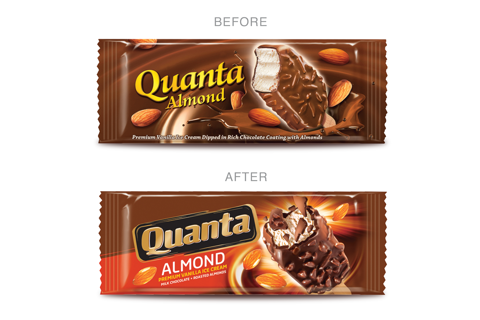
More was needed to grab the attention of the young TG so, Zlata Creative was bought in to completely re-invent and upscale QUANTA’s brand and value perception.

OUR APPROACH
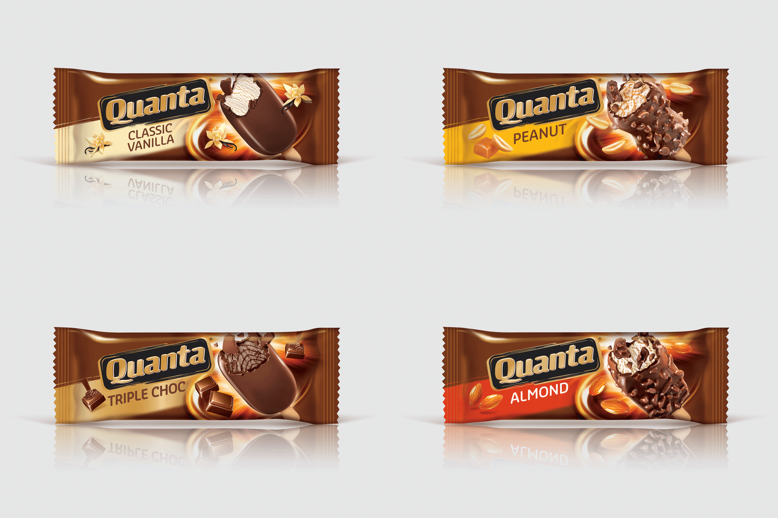
Our strategy to improve the reckless indulgence story on pack to better attract teenagers and young adults required a total visual overall. To build an iconic brand we started with a recognisable logo. The base architecture has bold colour coded bands integrated with dynamic eye catching product images. The exploding chocolate pieces further captured the moment of indulgence. Thus QUANTA was reborn and continues to grow strongly carving out a unique identity in the highly competitive Ice cream category.


