THE BRIEF
Stemming from the Arabic word for Light, NOOR the brand originated in 1993. Becoming a Brand leader, driven by its RTB of being the first Trans Fat Free cooking oil in the Middle East, NOOR is associated with being ‘Light on the stomach’ and ‘Premium’.
Zlata Creative was briefed to create a stand out upgrade, upscaling its value perception to better connect with a new modern consumer whilst retaining its existing Brand essence.

OUR APPROACH
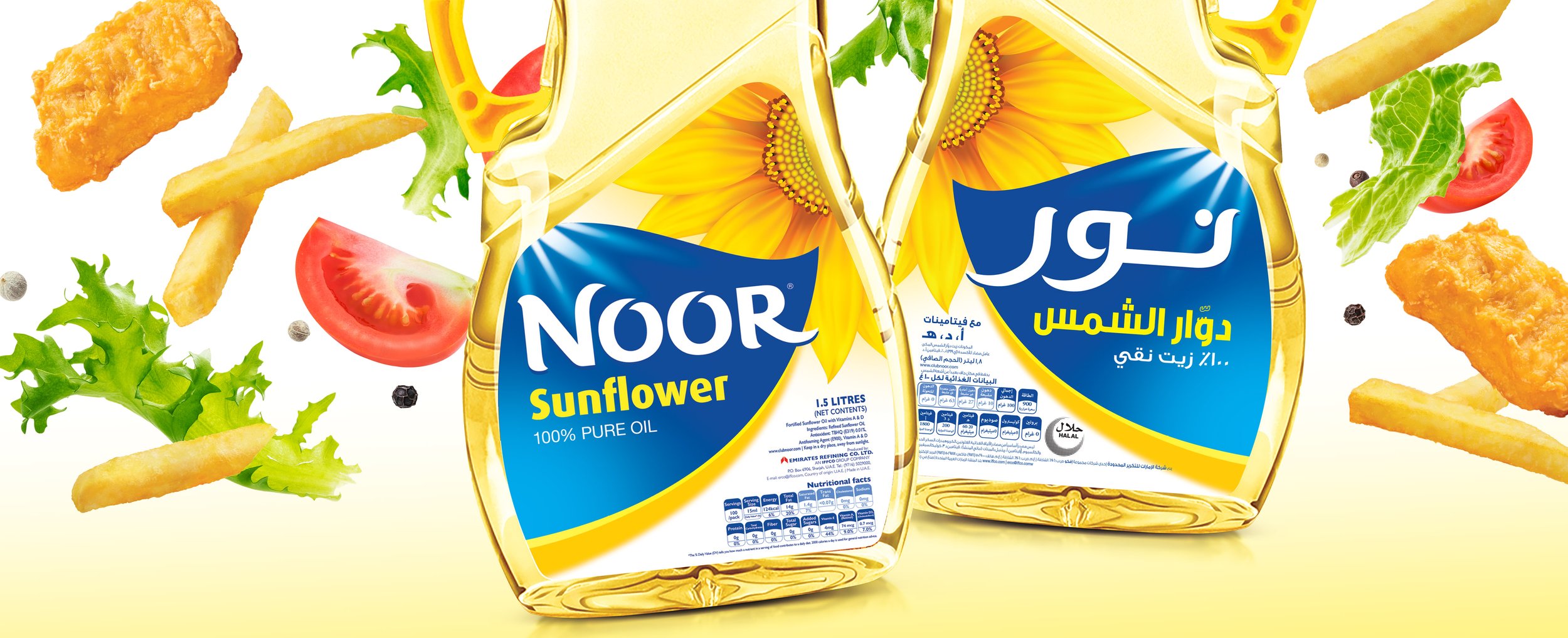
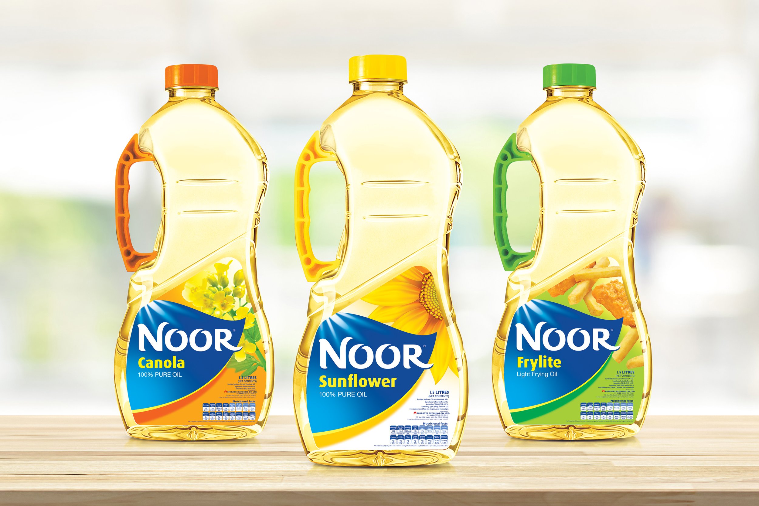
To achieve this, we created a new Brand architecture composed of a distinctive organic placeholder shape that contains the NOOR Brand logo, which was reinvented to become boldly confident with better standout.
In addition we improved and relocated the ingredients at the top corner, along with a softer colour coded area.
THE RESULT
NOOR was reborn and continues to grow strongly and expand into other culinary categories.
EXPANDING THE BRAND
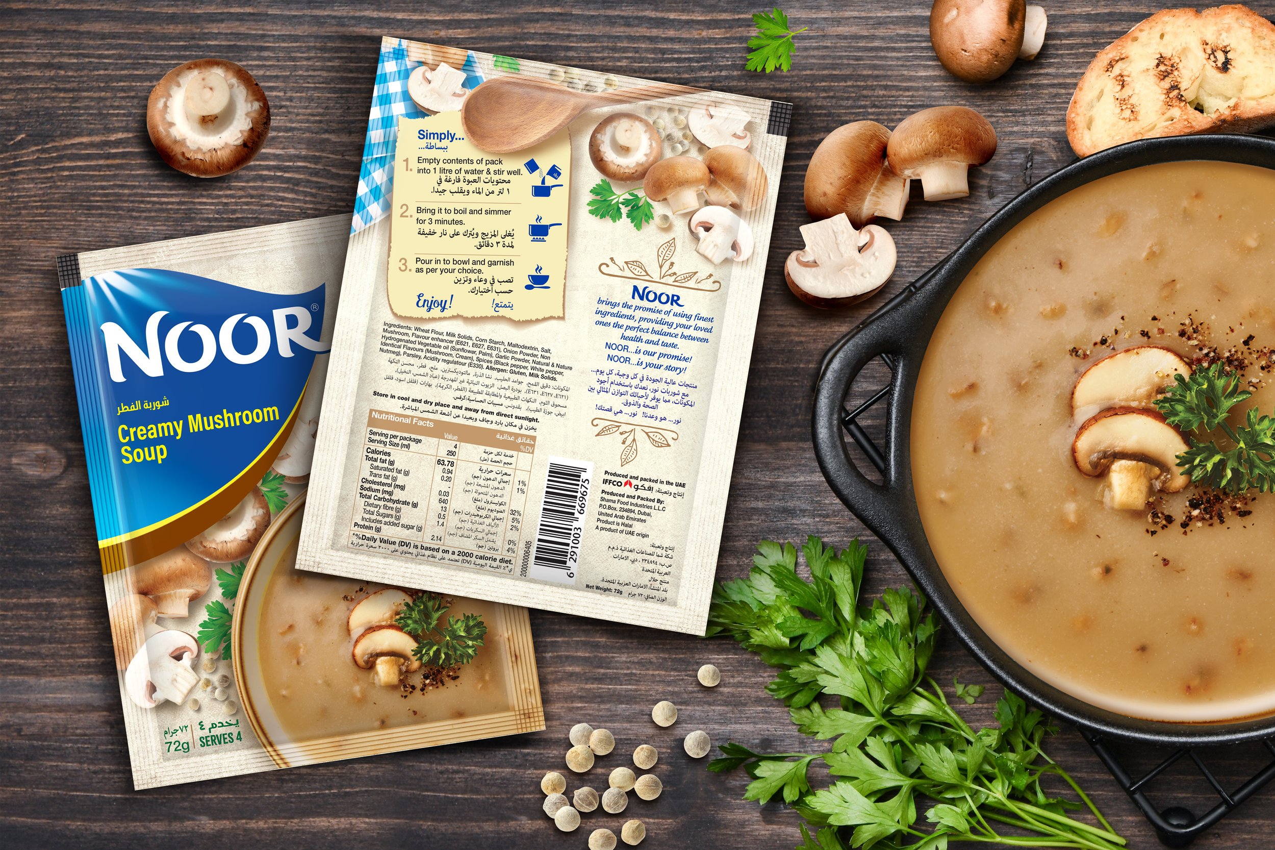
To build on the success of the core range, a new Soups range was created. Inspiring with the warmth and comfort of a homemade soup. Incorporating a recipe card style back of pack design to inspire and make for easy instructions.


