THE BRIEF
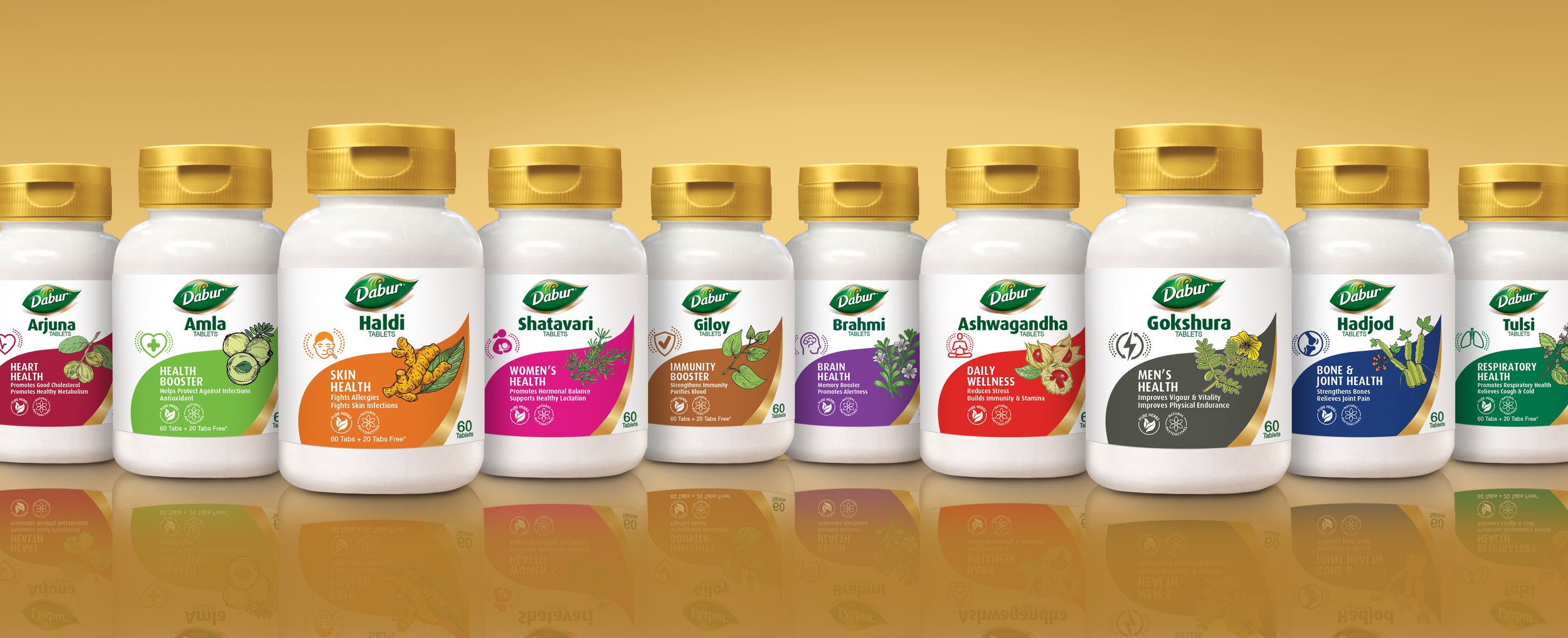
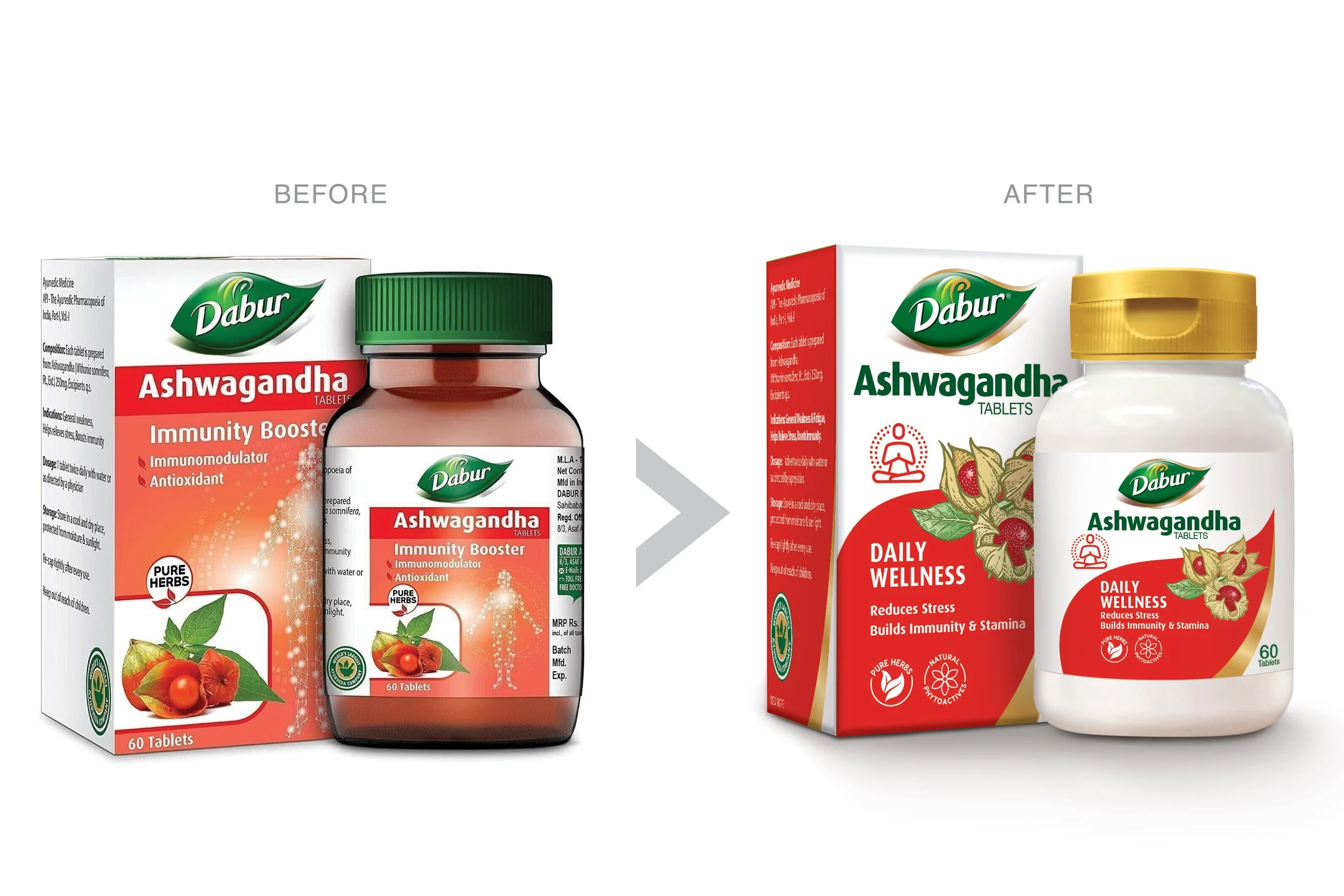
The design assignment was to refresh and modernize the complete DABUR HERBAL tablet portfolio with a consistent range look.
The main challenge was to ensure that the packaging modernised the Brand’s historic positioning as the Ayurvedic Expert who offers solutions for various health needs.

OUR APPROACH
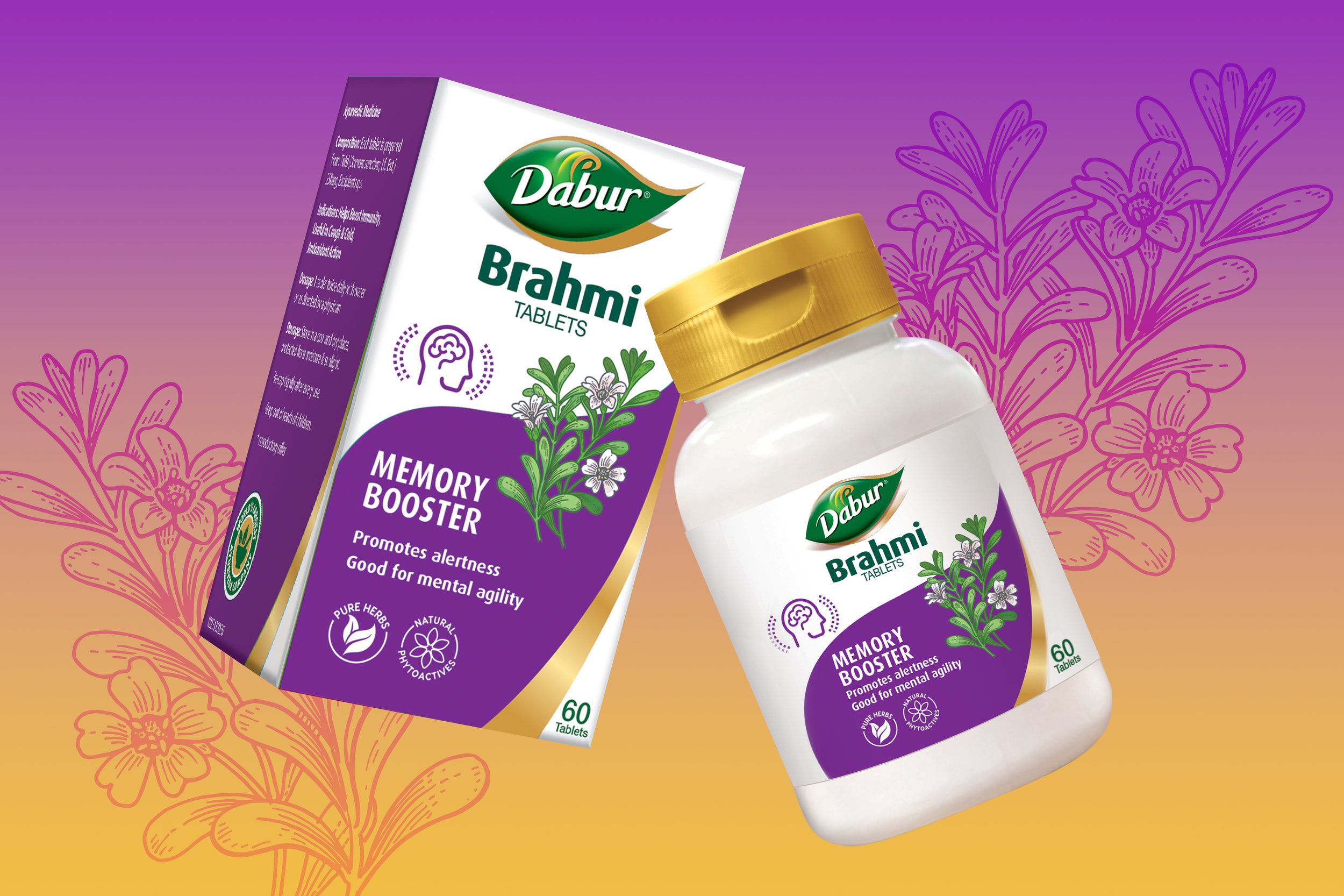
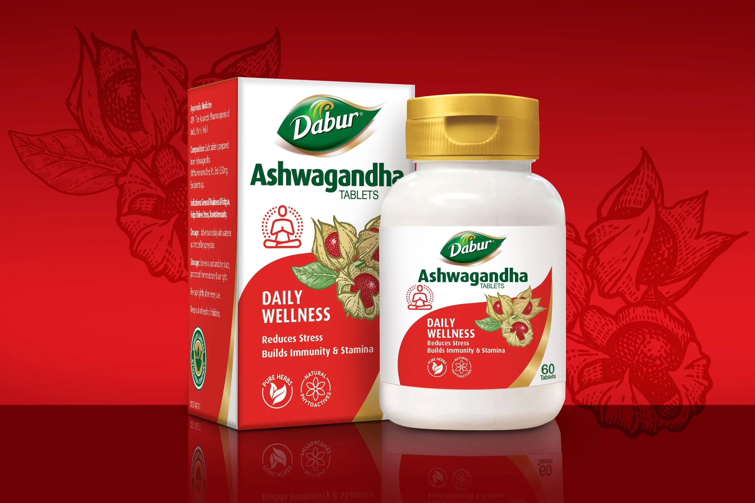
Embracing the need to focus on the specific herb and its core benefits we built a signature design architecture that featured an enlarged section of the Dabur Brand logo.
This shape was colour coded for each specific herb type creating variant recall value. Along with botanical style herb visuals that added credible therapeutic expertise to various everyday health problems.


