THE BRIEF
Dominated with cliche brown, chocolate pool and milk splashes ADORE chocolate bars were dark, sombre and recessive on shelf. Zlata Creative was briefed to modernise and contemporise ADORE’s brand identity and upscale its value perception.
OUR APPROACH
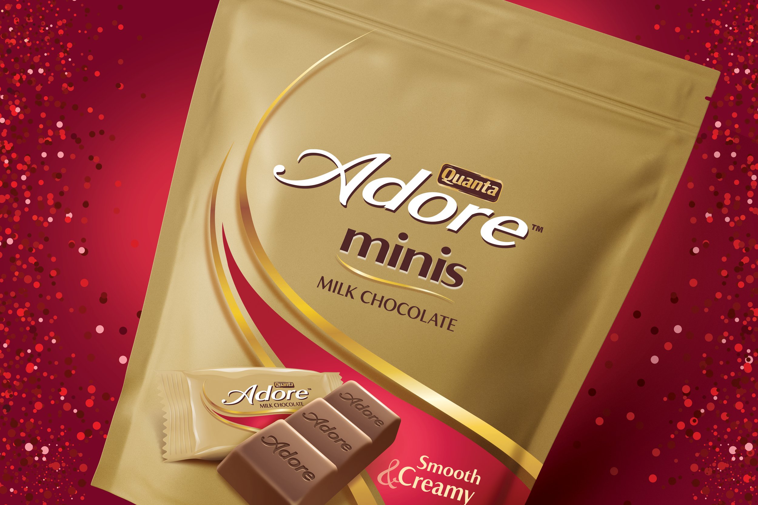
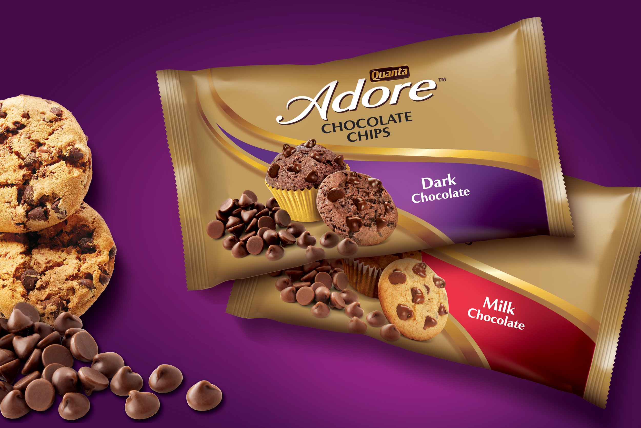
To create relevance we designed a memorable semiotic that confidently sweeps across the pack, creating an elegant new identity. The curvy sweep is now unique to ADORE, conveying chocolate that is smooth and creamy.
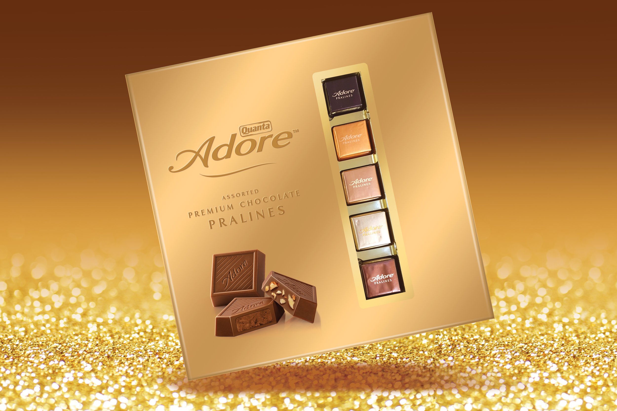
Gold was introduced as a master backdrop to add an alluring, premium expression.

THE RESULT
ADORE was reborn and continues to grow strongly and expand into other premium chocolate categories proudly owning its unique visual signature.


